KINOYUME CASE STUDY

A redesign of Kinoyume's mobile and desktop website to improve site navigation and flow

Project Type

Class Project


Project Role

Project Manager
UX/UI Designer

Duration

10 weeks


Teammates

Huimeng Lu
Jonathan Ly
Leon Tan

Overview

Project Context

Kinoyume is a Japanese restaurant located in La Jolla that specializes in Japanese comfort food including sushi, rice bowls, ramen, artisan Japanese sets, as well as drinks.
Our team visited Kinoyume and found that although the interior of their restaurant was incredibly homey and well decorated, their unpolished website failed to effectively reflect the style of the restaurant. In addition, users who were visiting the site found that they had a difficult time ordering food items from the menu.
Therefore, we decided to redesign and improve the aesthetic and flow of Kinoyume’s website to increase user enjoyment when visiting the site and allowing them to accomplish their goals more efficiently.

Full MOBILE Prototype Full DESKTOP Prototype

×

User Research

Identifying Client Needs: What does the client want out of their website?

After reviewing the website on our own, we did our own analysis and identified potential features that would need to be fixed, but we wanted to gather direct feedback from the manager of Kinoyume. During our first interview with our client, we found that the client was also unhappy with the current restaurant website and he identified a few specific features he wanted: a more presentable menu ordering system, consistent color schemes that better match the restaurant, and fixing broken links.

Identifying User Needs: What do visitors of the website want to see?

After finding out what the manager wanted out of the website, we went to the customers and conducted group interviews with the groups of Kinoyume customers to see which aspects of the website were pain points from a user perspective. Some major points the user hoped to see included: having a better looking site, making it easier to use, and being able to check restaurant reviews. Upon interviewing the customers, we grouped the interviewees into 3 user personas based on shared value: convenience, budget, or service.

Putting it all together

With all the information we received through interviewing our two major stakeholders, we now had to determine which aspects we would include in our prototype and define what was within the scope of our project and manageable within the time frame we had.

Competitive Analysis

What do other websites do well?

To investigate potential ideas and features for our site, we did competitive analysis of 5 other small Japanese restaurant sites and 2 chain restaurant websites to see how they demonstrated their color scheme, mood, site navigation, and other special features. Some of the key takeaways we drew from our analysis were to have very clean color palettes and styles throughout the site, splitting our long menu into different sections to allow for easier browsing, creating multiple pages for different sections of the site instead of having a singular landing page, and reducing the amount of text users will need to read. From these insights, we began thinking about site navigation and created moodboards that would encapsulate the feel of our website.

Design and Prototyping

Wireframing + Low Fidelity Prototype

With a clear vision of what we wanted to create for the website, we began with a wireframe that mostly outlined our site architecture, image placement, and home screen reorganization for both the mobile and desktop version. As a group, we also discussed potential issues and created fallback plans in case some of our features were not implementable.
After settling on our wireframe outline, we began adding in images, buttons, and actual text. My main role was working on the menu and its related pages, including the main menu page, the menu item customization page, and the payment page. In this first iteration, our menu had no images of specific dishes because the restaurant did not have the resources to be able to include an image with every single menu item. This was also where I included the idea of using tabular organization with icons to allow users to isolate and only see one food category at a time.

Critiques + Higher Fidelity Prototype

Upon completing our low fidelity prototype, we sought out critiques from our client, our peers, and our professor. Through this process, we received helpful feedback that allowed us to improve on our site. One major flaw we found was that we lacked any confirmation page, which made it unclear for the user whether their order had gone through or if their reservation was made. The site overall was still relatively plain so we added a cherry blossom background to begin synching the color scheme. I also experimented with a second version of the menu that split customization into a different page and enlarged the visual for the menu item. This would allow the menu page to appear less cluttered and allow the users to see the dish they are ordering which could help inform their decision.

Final Design

User Testing + Final Prototype

Upon completion of our previous iteration, we conducted one user test and provided them with scenarios to walk through our site. We received no complaints about the functionality and flow of our website, however they did have some qualms about our choice of background. They observed that the background was a little too distracting and clashed with the actual content of our website. The menu page was also a little too simple with the removal of all information except the name, image, and price of the dish. After receiving the feedback from this test, we created our final prototype.

Homepage

Features image carousel of dishes and saliend buttons that link to menu and reservation pages because they are the most common features needed by customers.

Menu

Allows for easy tabular organization of menu, displays images of each dish as well as the price and brief description. Leads to a second customization page after a dish is selected

Reservation

Calendar view for the reservation, reveals more details after a specific day is selected, only showing the time slots still available for that day, easy drop down to select party size

Reflection

What did I learn?

As this was my first time working with a client, one challenge our group faced was managing client expectations and aligning that with the customers’ needs and the widely-used practices in design. The feature that was most difficult to resolve was the inclusion of reviews on the website. Our client was adamant about not having reviews on the website or buying good reviews on Yelp because he felt it was biased and dishonest, whereas many of the users thought that the reviews were useful in helping them decide whether they wanted to eat there or what to order. We ended up deciding to follow the client’s request because, ultimately, the site was for him and the users could find other ways to find reviews themselves with external sites.
Overall, this experience taught me the importance of iteration and how our designs can sometimes drastically change over the lifespan of our project. My role in the creation of the prototype was creating the menu pages. My main struggle was determining the right balance of information that would be present within one screen. I experimented with both having too much and too little information and through getting many iterations of feedback, I was able to identify the perfect mix of both.
Ultimately, we were able to implement all of the features we planned for and created a site that I believe everyone was happy with.

Check out more projects:

Card image cap
LinkedIn Case Study

Evaluating and redesigning LinkedIn's job application pages for a more intuitive user experience

More Details
Card image cap
COGS 102C UCSD Sanitation

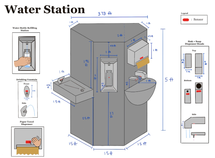
A study into the solution to address collective hygiene in densely-populated areas in UCSD

More Details
Card image cap
Bijoux Startup Concept

The development of a novel business concept that balances technical feasibility, financial viability, and desirability.

More Details